BLOG
July 19, 2021
The Jusnote’s Interface: How it Was Created and What Principles We Used
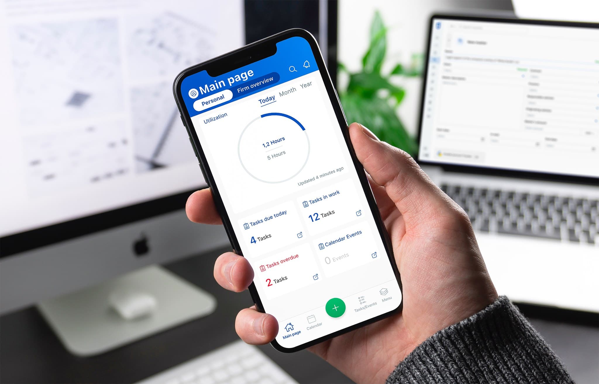
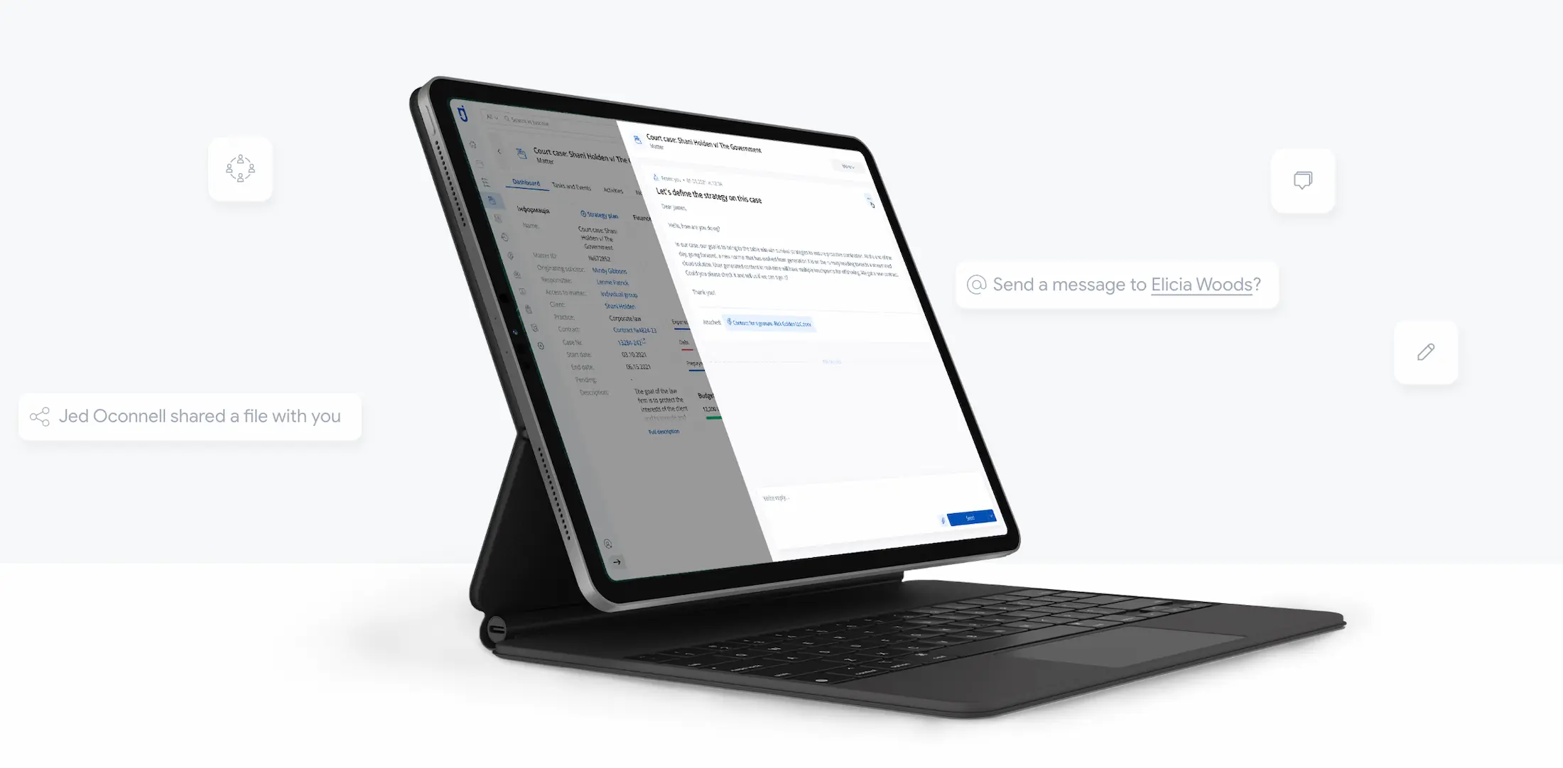
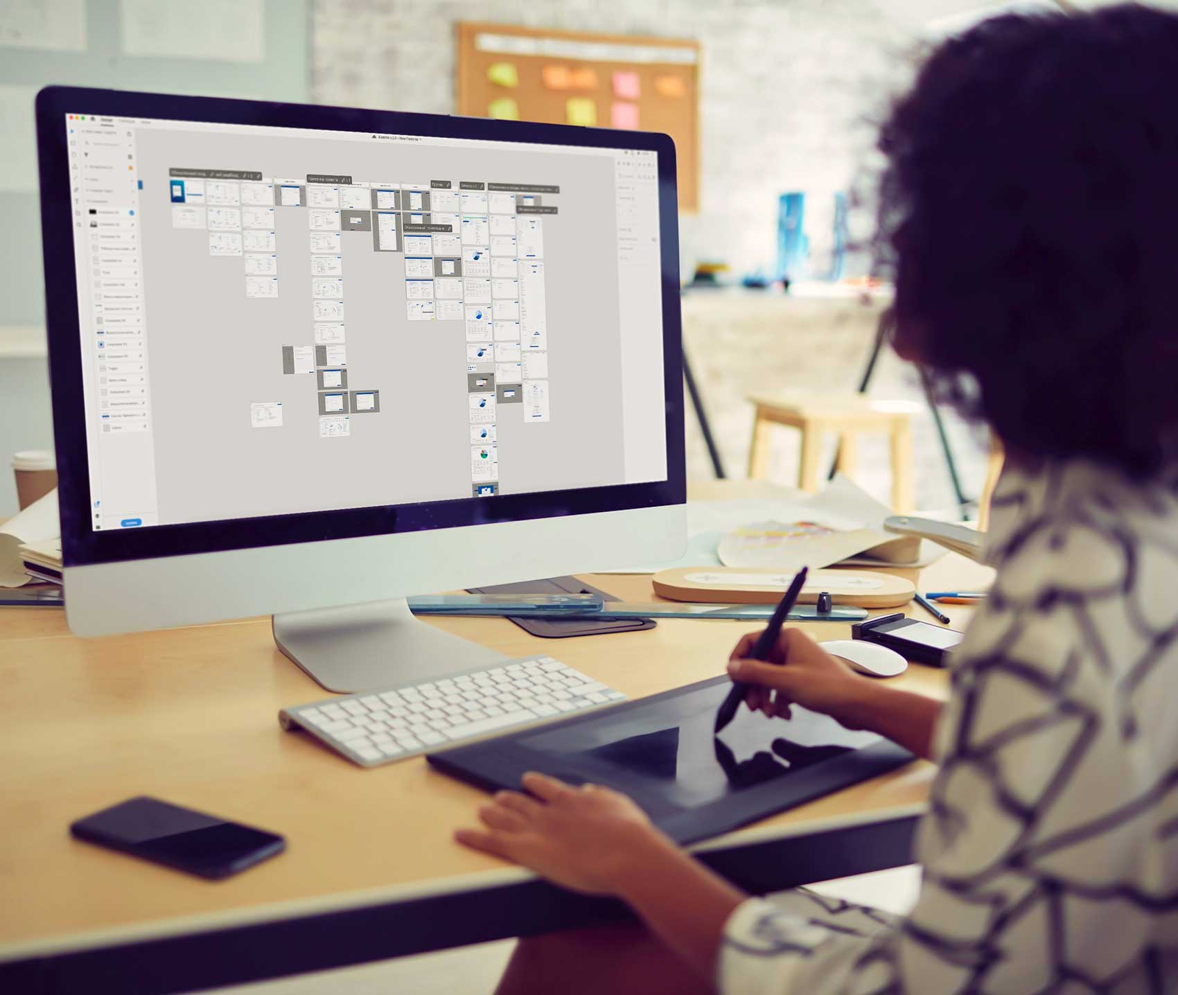
Jusnote is the best-known legal practice management software in Ukraine and one of the fastest-growing legal systems in the world. Despite the powerful functionality of the system, lots of lawyers choose it as a primary tool for managing their practice precisely because of the easy-to-use interface and simple user flows. In this short article, we will open up the curtain on how our designers were developing Jusnote and what principles they used.
About the system:
Jusnote is a cloud-based software that helps thousands of lawyers manage their daily legal practice, collaborate on matters (legal cases), work with tasks, bill work, and accomplish other essential things in one place. In 2020 Jusnote was recognized as the best legal system in Ukraine by Liga Zakon Awards, and in 2021 – one of the best in the world by Digital.
Here are several lessons we had learned after the design process of Jusnote was finished.
The number of clicks doesn’t affect the complexity of a product.
We have a myth that designers need to minimize the number of clicks made by users so that a product appears simpler to them. For instance, to create an account in Salesforce, a user must make 18 clicks, and in Jusnote – only 14. But does these products hard to use? Lots of people use them every day.

The essential thing is not how many clicks a user makes but how clear and simple this process appears to him. Your product may require four clicks to sign up, but if actions are unrelated and the UX design isn’t well-considered – these four clicks might take longer than 20 or 30 clicks in a well-designed product. If the user flow is created well and there are simple steps – no one will notice the difference between 15 and 25 clicks.
Reduce the number of colors.

CRM, ERP systems, and other software are not places where designers can show off their skills and abilities. The work of a designer in this particular case must combine functionality and simplicity. And if they manage to add aesthetics on top of that, then this is a top-level performance.
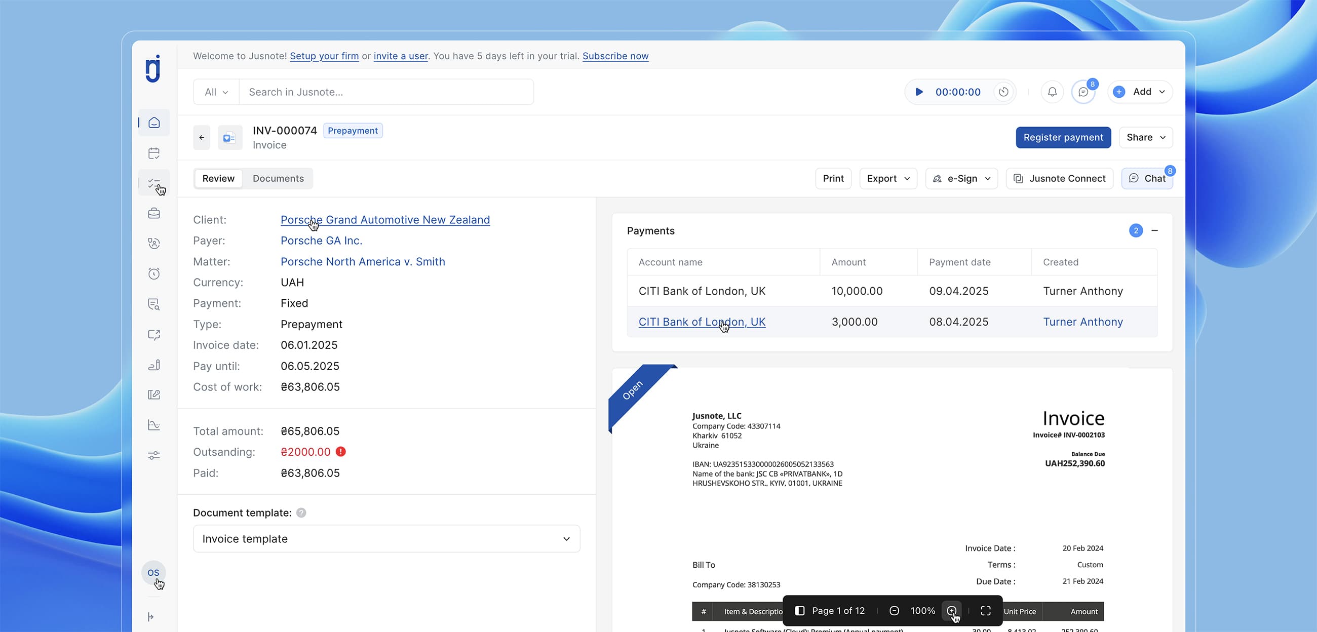
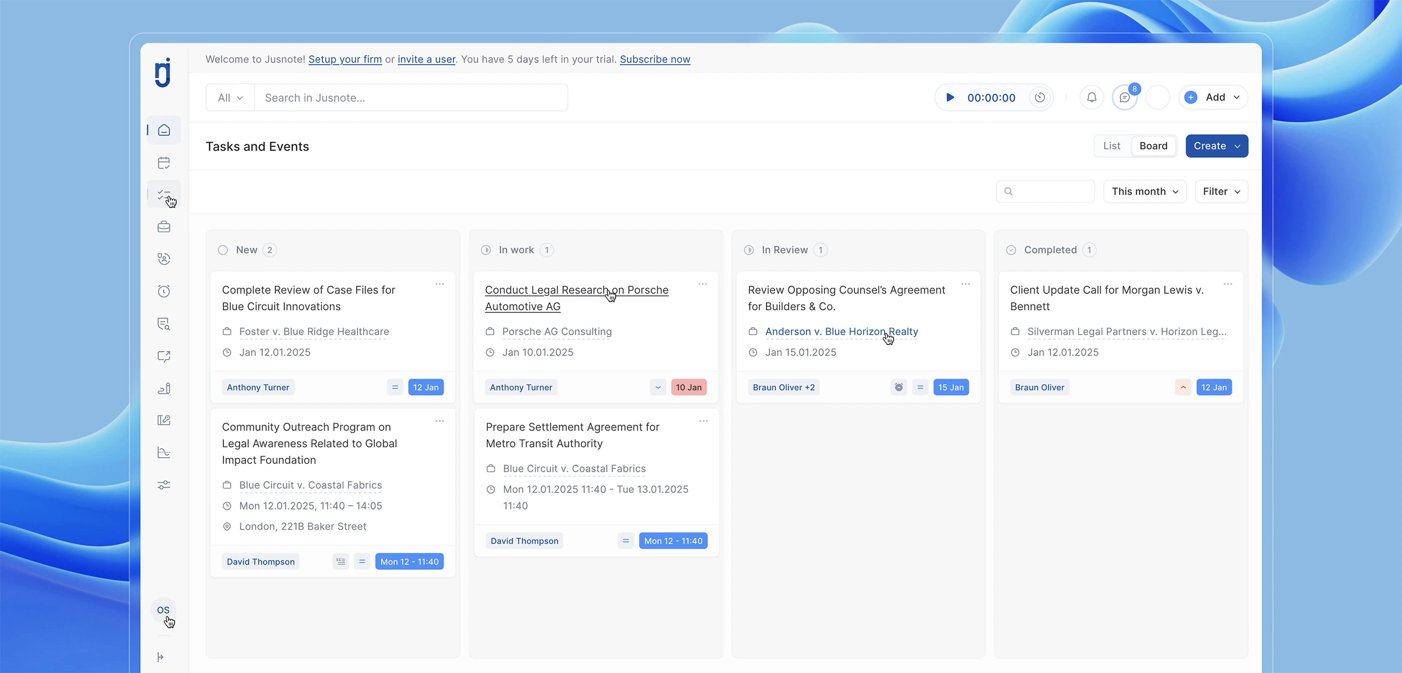
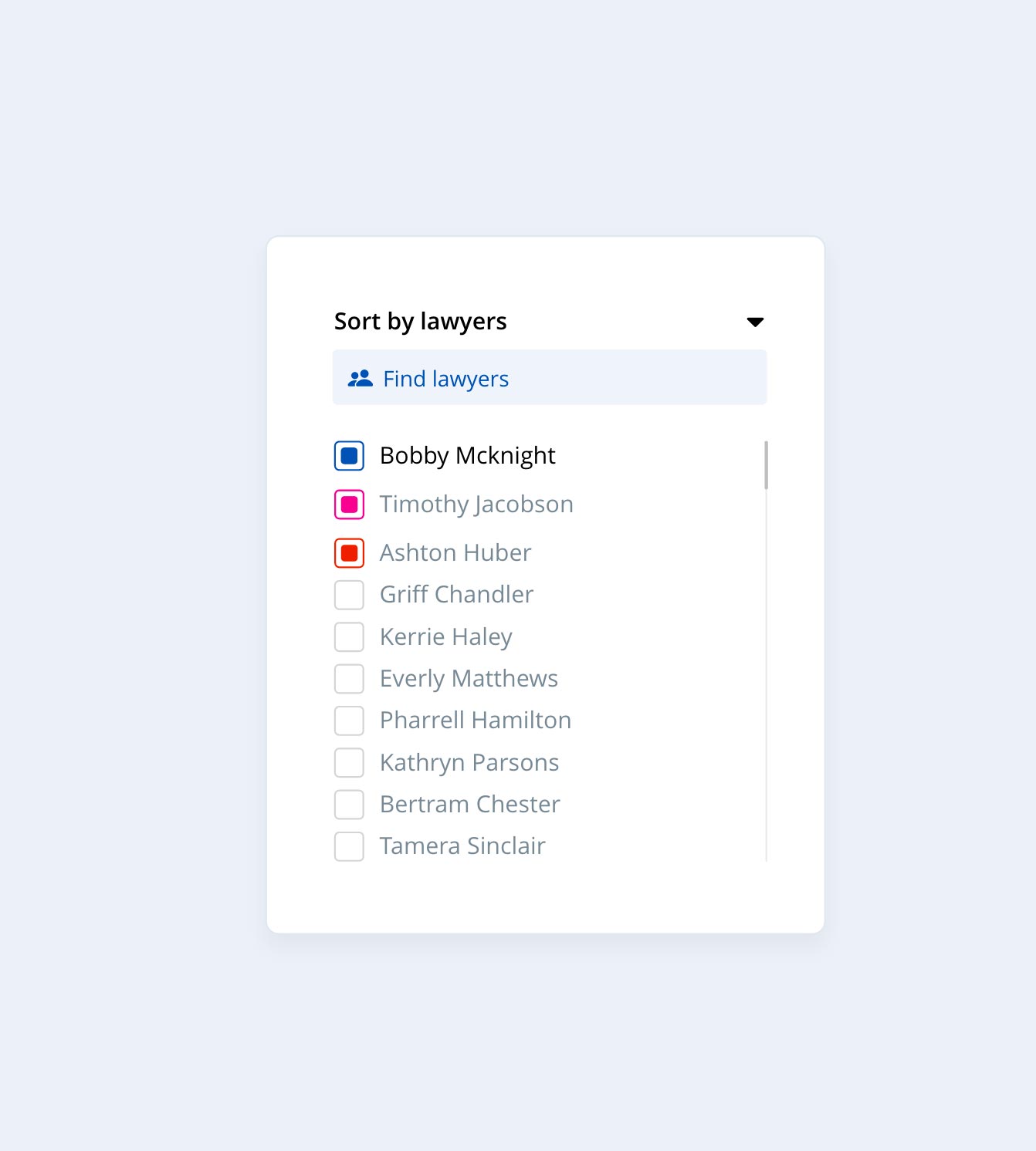
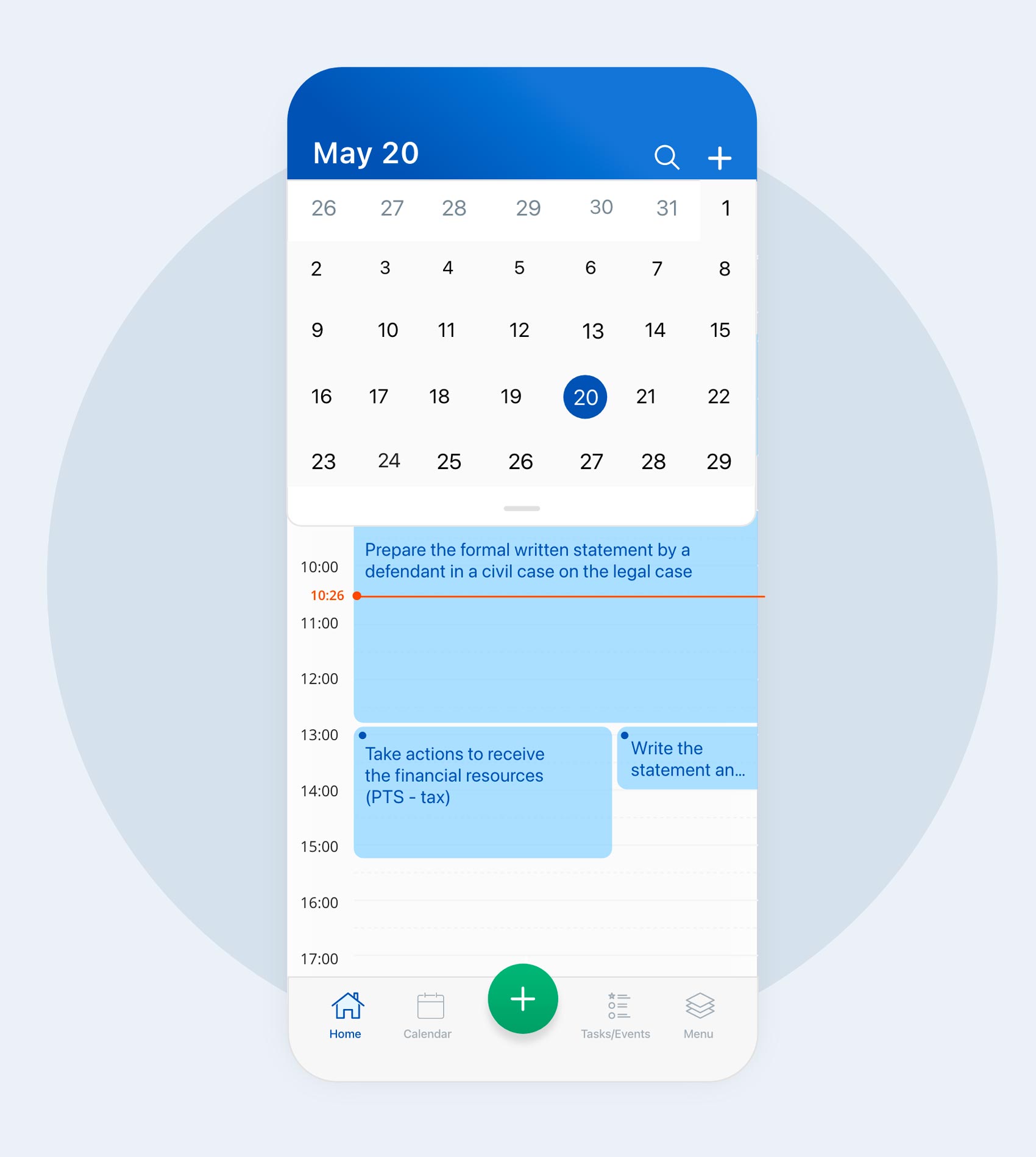
The software should be designed to help people accomplish their business goals and needs. In Jusnote, we reduced the number of colors to one primary color, one color for all the buttons and functional elements, and only a few for notifications and some states. So Jusnote looks neat and straightforward and creates a feeling of a clean and clear interface.
Designers must work collaboratively with developers even after the design process is finished.
When designers pass on a design to developers and are not oversee the development process, the product might be implemented not as needed.<.p>
Lots of ideas will be lost or implemented in the wrong way. The designer that created work must collaborate with developers until the completion of the product. We are not saying that developers don’t work very well. But, as a rule, they are not giving much attention to the visual side of the product. Jusnote ended up being 99.5% of what designers had created because from start to finish, they were working together. They discussed problems and jointly searched for solutions.
A product can’t be created in a vacuum. It is an interaction of people with different skills and knowledge, so if designers and developers are working together, you can be sure that a final result will be successful.
The user flow must have no dead ends.

Before Jusnote 2.0 had been created, the first version of the system was quite successful and operated on the local Ukrainian market. However, after a user had made mistakes, the system only showed the notification: “An error occurred” and did not specify why such an error had occurred. Most importantly, the system didn’t tell what a user should do to correct this error.
In the new version of Jusnote, we have made a function that suggests users ways to solve an occurred problem. It is an essential part of interface development. In general, each product has five conditions: successful action, pending, lack of response, error, inaction. And each state should have its consequences. If there is a mistake – what should one do? If waiting, then for how long? If an action is successful – what’s next?
Use a place efficiently.
We should never forget that the primary goal of the software we are developing is to help users conveniently work with data. And the best way to do this is to work with placing information.
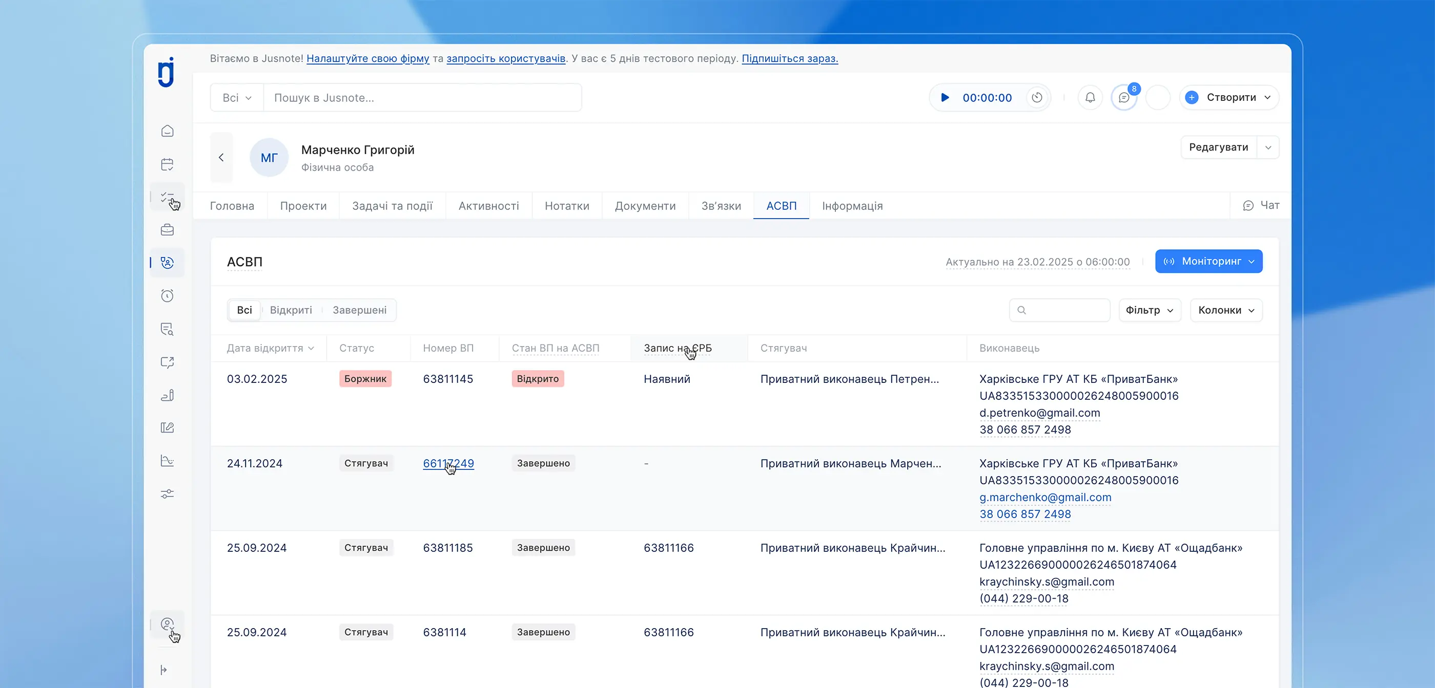
That is why the first thing we did was that we had allowed users to close and open the left menu (sidebar), thereby freeing up space for tables.
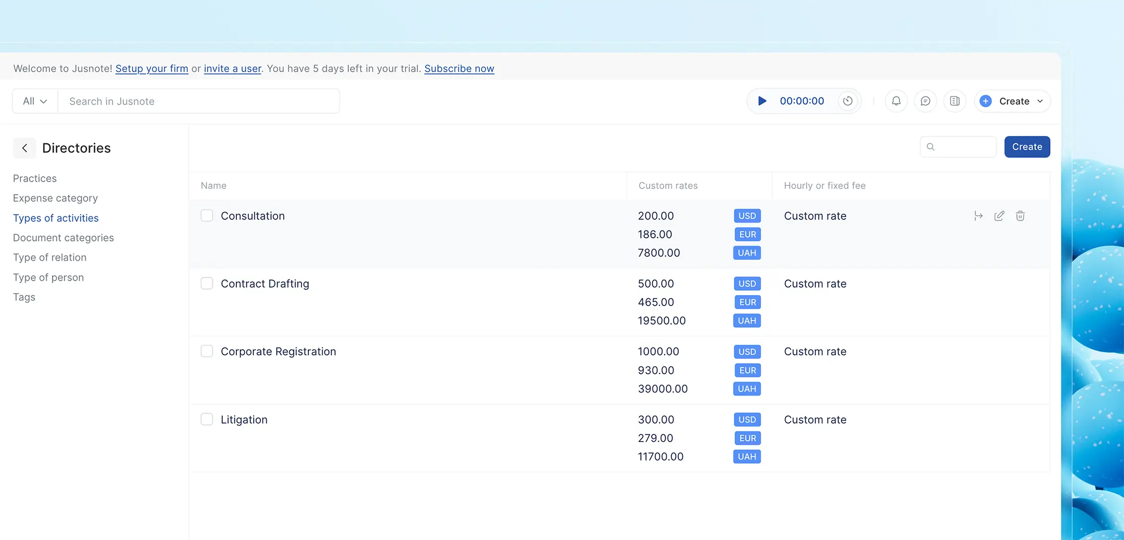
Secondly, we used almost the entire width of the screen to place tables and data cards.
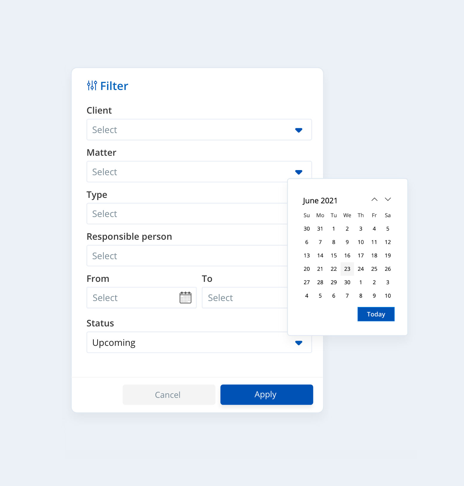
Thirdly, we moved all the function buttons to the hover state. So only if a user hovers on a button or, let’s say, “three dots” in the table, the system show all the tools that are necessary now. We didn’t want to create a system where all the information is unstructured. A place is a tool. And designers should be able to use it efficiently.
A designer and a visionary of the product should work together.

Without intermediaries. Everyday. You will get a high-quality product only when uniting a person who understands the market and a professional designer together. You won’t create a high-quality product by having a Zoom call once a week. For some time, you will need to wake up thinking about the product and go to bed still thinking about it; and discuss its implementation all the time. Jusnote was created together with Oleg Smotrov, the CEO of Jusnote, who understands its tasks best. If we hadn’t talked every day and discussed the product, we wouldn’t have created such a well-considered and powerful system.
Thoughts about a good designer
A good designer is much more than just a person who knows Adobe. A good designer is a psychologist who understands human behavior and can predict further needs and actions. It is a person who observes a lot, reads a lot, and learns a lot. It is the one who perfectly knows the business of the client. Only after all that, it’s about a professional, who in detail knows the theory of color, typography, composition, knows about working with contrast, negative space, and so on.
And if companies think that good design is expensive, they should be well aware of the fact that a bad design will cost them much more. And at the end of the day, it may prevent a great idea from reaching its final destination.
![]()
Created with Smotrow Design
The Jusnote Software was designed in collaboration with Smotrow Design – a leading Ukrainian design studio specializing in product design and engineering. Learn more


 Jusnote Newsroom
  Search Newsroom
 Back to all publications


